Is Africa Depicted Smaller On Maps

BSC Insights Admin
September 30, 2026
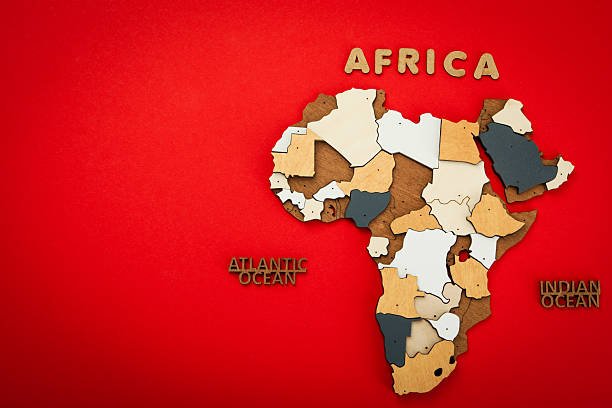
Yes, Africa is indeed depicted significantly smaller on many common world maps, particularly those using the ubiquitous Mercator projection. This widespread cartographic distortion has led to a pervasive misconception about the continent's actual immense size, often underestimating its geographical scale and global importance. Understanding why Africa appears reduced requires delving into the science of map projections and the inherent challenges of representing our spherical planet on a flat surface, revealing a fascinating story of cartographic compromise and historical legacy.
The Mercator Projection: A Historical Perspective
The primary reason for Africa appearing smaller on maps stems from the dominance of the Mercator projection. Invented by Gerardus Mercator in 1569, this cylindrical map projection was revolutionary for its time, providing a groundbreaking solution for navigation. Its key feature is that it preserves angles and shapes, making it invaluable for sailors who could plot a course (a rhumb line) as a straight line on the map. This characteristic made it the standard for nautical charts for centuries and, subsequently, for many world maps found in classrooms and atlases.
However, the Mercator projection achieves this navigational accuracy at a significant cost: distortion of landmass size, particularly as one moves further away from the equator. Areas closer to the poles, such as Greenland, Russia, and Canada, are stretched disproportionately, appearing much larger than they are in reality. Conversely, landmasses near the equator, like Africa and South America, are compressed, making them look smaller than their true geographical extent.
Understanding Map Distortions
Representing a three-dimensional sphere (Earth) on a two-dimensional plane (a map) is an impossible task without introducing some form of distortion. Cartographers face a fundamental dilemma: they cannot simultaneously preserve all properties—area, shape, distance, and direction—accurately. Every map projection is a compromise, prioritizing certain characteristics over others.
- Area Distortion: Projections like Mercator sacrifice accurate area representation to maintain shape and direction. This is why Africa's true size is often obscured.
- Shape Distortion: Some projections preserve area but distort shapes, making continents look stretched or squashed.
- Distance Distortion: No flat map can show all distances accurately from all points.
- Direction Distortion: While Mercator preserves local directions, global directions can still be misleading.
The choice of projection is crucial and reflects the map's intended purpose. For navigation, Mercator excelled. For an accurate understanding of landmass sizes and global resource distribution, it falls short, leading to the common question: Is Africa depicted smaller on maps?
The True Scale of Africa
Contrary to its common portrayal on Mercator-based maps, Africa is a continent of truly colossal proportions. It is the second-largest continent on Earth, encompassing a land area of approximately 30.3 million square kilometers (11.7 million square miles). To put this into perspective, Africa is significantly larger than many people realize, easily dwarfing countries and even entire regions that often appear larger on Mercator maps.
Consider these striking comparisons that highlight the true size of Africa:
- Africa is larger than the combined land area of China, India, the contiguous United States, and most of Europe.
- You could fit the entire United States (including Alaska), China, India, Japan, and most of Europe comfortably within Africa's borders.
- Its landmass is roughly three times the size of Europe and larger than the sum of all countries that make up the European Union.
- Greenland, often depicted as comparable in size to Africa on Mercator maps, is actually only about 1/14th the size of Africa.
This immense scale contributes to Africa's incredible diversity, from vast deserts like the Sahara to dense rainforests, sprawling savannas, and towering mountain ranges. Its sheer geographical extent underlines the misconception created by distorting map projections.
Visualizing Africa's Real Magnitude
To truly grasp Africa's actual dimensions, it helps to visualize its capacity. Imagine:
- You could fit countries like France, Spain, Germany, Italy, Switzerland, and the UK into West Africa alone, with room to spare.
- The Democratic Republic of Congo, one of Africa's largest countries, is roughly the size of Western Europe.
- Sudan, though recently split, was once the largest country in Africa and could contain many European nations.
These comparisons reveal how profoundly misleading the standard Mercator projection can be, diminishing the perceived physical presence and importance of an entire continent. The visual impact of these maps shapes our mental geography, and rectifying these distortions is key to a more accurate global understanding.
Alternative Map Projections and Their Benefits
Recognizing the inaccuracies of the Mercator projection, especially its tendency to minimize equatorial regions and inflate polar ones, cartographers and educators have explored and advocated for alternative projections that offer a more accurate representation of relative landmass sizes.
The Gall-Peters Projection
One of the most notable alternatives is the Gall-Peters projection (often simply called the Peters projection), which gained prominence in the 1970s. Arising from a desire for a "fairer" representation of the world, especially in an educational context, this projection is designed to preserve accurate relative areas. This means that if one continent is twice the size of another in reality, it will appear twice the size on a Gall-Peters map.
The trade-off for this area accuracy is shape distortion. Continents appear elongated and stretched, particularly near the equator, which can look unfamiliar to eyes accustomed to the Mercator. Despite its visual oddities, the Gall-Peters projection served as a powerful counterpoint to the Mercator, explicitly addressing the question of Africa's depicted size on maps by offering a projection where Africa's true enormity is clearly visible.
Other Projections (e.g., Winkel Tripel, Robinson)
Many other projections attempt to strike a balance between various distortions. The Winkel Tripel projection, for instance, is a compromise projection that minimizes distortion in area, direction, and distance. It was adopted by the National Geographic Society in 1998 for its world maps, replacing the Robinson projection, which had been their standard since 1988. Both the Winkel Tripel and Robinson projections aim for a visually pleasing aesthetic while offering a less extreme area distortion than the Mercator, though they do not achieve perfect area accuracy like the Gall-Peters.
These alternatives underscore the fact that there is no single "perfect" map. The choice of projection is always about what properties are prioritized, and understanding these choices is fundamental to interpreting geographical information accurately and addressing whether Africa is depicted smaller on maps than it truly is.
Why Does the Mercator Persist?
Despite its significant distortions in landmass size, particularly for continents like Africa, the Mercator projection remains widely used and is often the first world map people encounter. Several factors contribute to its enduring presence:
- Historical Inertia and Familiarity: For centuries, the Mercator was the standard. Generations grew up with it, embedding its visual representation of the world deeply into collective consciousness. Changing this deeply ingrained mental map is challenging.
- Navigational Utility: While modern navigation relies heavily on GPS, the Mercator's unique property of showing rhumb lines as straight lines was incredibly useful for centuries of seafaring and still holds some pedagogical value in explaining navigation principles.
- Ease of Reproduction: Its rectangular grid makes it relatively straightforward to produce and tile, fitting neatly into textbooks and digital displays.
- "Eurocentric" Bias (Debatable): Some critics argue that the Mercator's popularity, which inflates the size of Europe and North America relative to Africa and South America, aligned with and reinforced a Eurocentric worldview during the era of colonialism and global dominance by European powers. While Mercator himself had no such intent, the projection's visual effect certainly contributed to a perception of larger, more dominant northern continents.
Understanding these reasons helps explain why, despite its known flaws regarding area accuracy, the Mercator continues to be a go-to map, perpetuating the visual misconception of Africa being depicted smaller on maps.
The Impact of Map Distortions on Perception
The way maps portray the world has a profound impact on our perception of geopolitics, economic power, and cultural importance. When Africa is depicted smaller on maps, it can inadvertently diminish its perceived significance on the global stage. This visual understatement can contribute to a skewed understanding of its actual influence, resources, and demographic weight.
- Geopolitical Misunderstandings: A smaller-looking Africa might unconsciously lead people to underestimate its strategic importance or the scale of its internal challenges and opportunities.
- Resource Underestimation: Africa is incredibly rich in natural resources. A shrunken depiction might downplay the vastness of its resource base.
- Population Scale: With a rapidly growing population, Africa is home to billions. Its true geographical scale is necessary to appreciate the distribution and challenges of this population.
- Cultural Bias: Maps are not neutral. The consistent visual reduction of Africa, while perhaps unintentional, can reinforce subconscious biases and stereotypes about the continent's role in world affairs.
Being aware of these distortions is the first step towards developing a more accurate and nuanced global perspective, fostering a deeper appreciation for the true geographical and human landscape of our planet.
Educating for a More Accurate Worldview
Addressing the common misconception that Africa is depicted smaller on maps than its true size is crucial for fostering global literacy and challenging ingrained biases. Education plays a vital role in correcting these cartographic distortions and promoting a more accurate understanding of the world.
Here are several ways to cultivate a more informed perspective:
- Teach Map Literacy: Emphasize that all flat maps have distortions and teach students to critically evaluate maps based on their projections. Explain the different properties that projections preserve or distort (area, shape, distance, direction).
- Introduce Multiple Projections: Instead of relying solely on the Mercator, expose learners to a variety of map projections, such as the Gall-Peters (for true area) and Winkel Tripel (for a good overall balance). This demonstrates that there isn't one "correct" world map.
- Use Interactive Tools: Websites like "The True Size Of..." allow users to drag and drop countries onto different parts of the globe, dynamically showing how their apparent size changes based on latitude. This hands-on experience powerfully illustrates the distortions, especially how surprisingly large Africa truly is.
- Provide Comparative Data: Supplement visual maps with statistical data on land area, population, and economic indicators to provide a quantitative understanding of continents' true scales and global standing.
- Highlight Africa's Diversity: Beyond just size, emphasize the immense cultural, ecological, and geographical diversity within Africa, reinforcing its complexity and vastness.
By actively engaging with these educational strategies, we can move beyond the misleading visuals of traditional maps and build a more accurate and respectful understanding of Africa's immense and vital place in the world.
Conclusion
In conclusion, the answer to "Is Africa depicted smaller on maps?" is a resounding yes, primarily due to the widespread use of the Mercator projection. This historical map, while excellent for navigation, severely distorts the size of landmasses away from the equator, making continents like Africa appear significantly smaller than their actual immense scale. Africa is, in fact, the second-largest continent, far exceeding the size of many countries and regions it appears equal to or smaller than on Mercator maps. Understanding these cartographic realities and exploring alternative projections like the Gall-Peters or Winkel Tripel is essential. It allows us to challenge long-held visual biases, appreciate Africa's true geographical and geopolitical significance, and foster a more accurate and informed global worldview.
Enjoyed this read?
Share it with your friends and colleagues.