Is Africa Upside Down On The Map

BSC Insights Admin
July 01, 2026
The question, "Is Africa upside down on the map?", stems from a common misconception that maps have a universally "correct" orientation. In reality, Africa, like all other continents, has no inherent "up" or "down" in space, and its representation on maps is purely a convention of cartography. The familiar north-up orientation of most world maps is an arbitrary choice, largely influenced by historical factors and dominant map projections, rather than a reflection of a cosmic truth.
Understanding this requires a journey into the fascinating world of map projections, the science of flattening our spherical Earth onto a two-dimensional surface. While seemingly simple, this process inevitably introduces distortions, leading to varying perceptions of continents' sizes and positions. This article will delve into why our perception of Africa's orientation and size has been shaped, explore the arbitrary nature of map directions, and reveal the true geographical grandeur of the African continent.
Understanding Map Projections: Why Our World Looks Different
To answer whether Africa is "upside down," we first need to grasp the fundamental concept of map projections. Imagine peeling an orange and trying to flatten its spherical skin onto a table without tearing or stretching. It's impossible to do without some degree of distortion. The same challenge applies to mapping our roughly spherical Earth onto a flat piece of paper or a computer screen.
A map projection is a mathematical method of transferring features from the Earth's three-dimensional surface onto a two-dimensional plane. Because this transformation is inherently imperfect, every map projection introduces distortions in one or more of the following properties:
- Area (Equivalence): The relative sizes of landmasses.
- Shape (Conformality): The true shapes of continents and countries.
- Distance: The accurate distances between points.
- Direction (Azimuthality): The true bearings from a central point.
Cartographers choose a projection based on the map's purpose. For instance, a map for nautical navigation might prioritize accurate compass directions, even if it distorts area. A map designed to compare the sizes of continents, however, would prioritize area accuracy. The familiar world map we see in most classrooms and atlases is often based on the Mercator projection, a projection with specific characteristics that have profound implications for how we visualize the world, including Africa's perceived size and orientation.
The Dominant Mercator Projection and Its Global Influence
The Mercator projection, developed by Gerardus Mercator in 1569, is perhaps the most famous and widely used map projection in the world. It was revolutionary for its time, providing a clear and consistent grid that made it invaluable for European navigators exploring the globe. Its key feature is that it preserves angles and shapes, making it "conformal," which was essential for plotting accurate compass bearings for sea voyages.
Distortions of the Mercator Projection
While excellent for navigation, the Mercator projection comes with a significant trade-off: extreme distortion of area, especially near the poles. On a Mercator map:
- Landmasses far from the equator appear disproportionately large. Greenland, for example, looks comparable in size to Africa, when in reality, Africa is approximately 14 times larger than Greenland.
- Canada and Russia also appear much larger than their actual sizes.
- Conversely, continents closer to the equator, such as Africa and South America, appear visually "shrunken" or smaller than their true proportion.
This visual misrepresentation has had a profound, albeit often unconscious, impact on how generations perceive global geography and geopolitics. For many, the Mercator map became the authoritative image of the world, shaping our understanding of the relative importance and scale of different regions, often at the expense of the Global South.
Challenging the Status Quo: Alternative Map Projections
Recognizing the limitations and potential biases of the Mercator projection, cartographers and educators have championed alternative projections that offer different perspectives and prioritize different aspects of accuracy. These maps help us visualize the Earth more equitably and critically assess our geographic assumptions.
The Gall-Peters Projection: Emphasizing Area Accuracy
One of the most notable alternatives is the Gall-Peters projection (often simply called the Peters projection), developed by Arno Peters in the 1970s, based on an earlier design by James Gall. Its primary goal is to represent the accurate relative sizes of all landmasses. Unlike Mercator, it is an "equal-area" projection.
- On a Gall-Peters map, continents like Africa and South America appear much larger and more prominent, reflecting their true land area.
- Conversely, regions like Greenland and Canada shrink considerably, showing their actual smaller scale relative to equatorial landmasses.
- The trade-off is that shapes are distorted, appearing stretched or elongated, particularly in higher latitudes.
The Peters projection gained significant attention for its explicit aim to challenge Eurocentric views embedded in the Mercator map, advocating for a more balanced representation of the world's continents and their populations. Organizations like UNESCO have adopted it to promote a more equitable view of the world.
The Robinson Projection: A Compromise for General Use
The Robinson projection, developed by Arthur H. Robinson in 1961, is widely used for general-purpose world maps. It is neither truly equal-area nor conformal, but instead aims for a visually appealing compromise between distortions of area, shape, and direction. It curves the parallels of latitude to reduce the extreme stretching seen in Mercator maps, making it a good choice for atlases and classroom maps where a balanced view is desired.
The Dymaxion Map (Fuller Projection): A Radical Reorientation
Buckminster Fuller's Dymaxion map (officially the Fuller projection) offers a truly radical departure from conventional mapping. It projects the Earth's surface onto a polyhedron (specifically, an icosahedron) which can then be unfolded into a two-dimensional net. The key features include:
- It has minimal distortion of relative area and shape.
- It presents the continents as nearly one contiguous landmass, emphasizing the interconnectedness of Earth's land.
- Crucially, it has no "right way up." It can be oriented in any direction, challenging the traditional north-up perspective altogether and reinforcing the idea that geographic orientation is arbitrary.
Is There a "Right Way Up" for a Map? The Arbitrary Nature of "North"
The concept of Africa being "upside down" on a map fundamentally relies on the assumption that "north" must be at the top. However, this is a purely human convention, not a geophysical absolute.
The Historical Roots of "North-Up" Maps
The widespread adoption of north at the top of maps is largely a historical artifact, particularly influenced by European cartography during the Age of Exploration. Key factors include:
- Magnetic Compass: The magnetic compass needle points generally towards the Earth's magnetic north pole, making it a convenient and reliable reference point for navigation.
- Ptolemy's Influence: The influential Roman-Egyptian geographer Claudius Ptolemy, whose work heavily influenced Renaissance cartographers, oriented his maps with north at the top.
- Dominant Worldview: As European powers expanded their influence globally, their cartographic conventions, including north-up orientation, became dominant.
There is no scientific reason for north to be superior to any other direction. If you were to look at Earth from space, "up" and "down" are meaningless concepts in the vacuum. The Earth simply tumbles through space, orbiting the sun, with its axis tilted. There is no absolute celestial reference point for "up."
Maps with Alternative Orientations
Throughout history, and even today, maps have been oriented in various ways:
- East-up maps: Many ancient Islamic maps, such as those by al-Idrisi, placed East (the direction of Mecca) at the top.
- South-up maps: Also known as "reverse maps" or "upside-down maps," these maps place the Southern Hemisphere at the top. While initially jarring to those accustomed to north-up maps, they are perfectly valid and offer a fresh perspective, sometimes highlighting the significance of the Global South. Countries like Australia often use maps with the south at the top to challenge traditional perspectives.
- Maps centered on other points: Some maps are centered on specific continents or oceans, further illustrating the subjective nature of "global" orientation.
These alternative maps underscore that our common north-up orientation is a matter of tradition and convenience, not a universal law. Africa is therefore no more "upside down" when north is at the top than Europe would be if south were at the top.
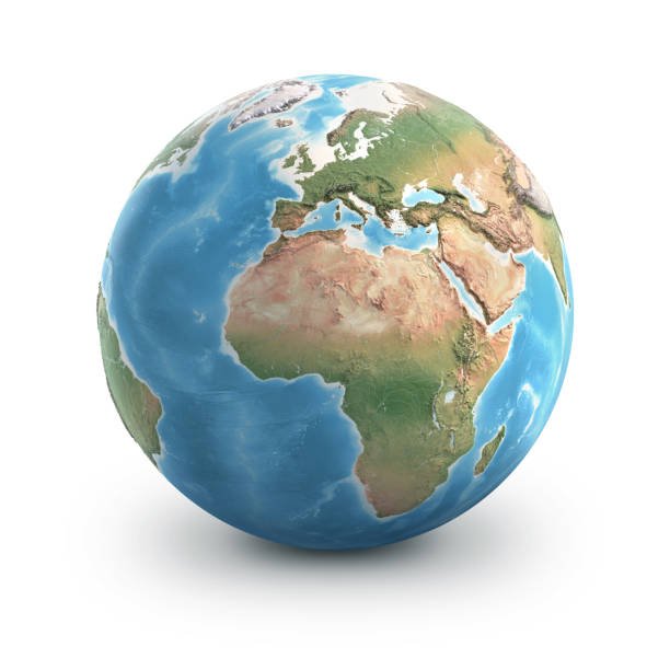
The True Size and Significance of Africa
Beyond the discussion of orientation, the distortion introduced by the Mercator projection has significantly downplayed the true, immense scale of the African continent. Africa is not just one country; it is a vast continent comprising 54 recognized countries, stretching over a colossal land area.
Africa's Actual Dimensions: A Geographical Colossus
Consider these facts about Africa's true size:
- Africa is the second-largest continent in the world, both by land area (approximately 30.3 million square kilometers or 11.7 million square miles) and population.
- It is so large that you could fit the United States, China, India, Japan, and most of Europe all inside its borders, and still have room to spare.
- Its north-south extent spans approximately 8,000 kilometers (5,000 miles), and its east-west extent is roughly 7,500 kilometers (4,700 miles).
- The continent crosses the equator, with vast portions in both the Northern and Southern Hemispheres, giving it an incredible range of climates, ecosystems, and biodiversity.
This geographical reality starkly contrasts with the often-smaller depiction on Mercator maps, which can lead to an underestimation of Africa's global significance, its vast natural resources, and its diverse cultures. Recognizing Africa's true scale is crucial for a balanced global perspective.
The Psychological Impact of Map Design
The way we visualize the world through maps has a profound psychological and cultural impact. Maps are not merely neutral scientific instruments; they are powerful tools that shape our worldview, influence our perceptions of power, and can even reinforce biases.
When the Mercator projection visually enlarges the Northern Hemisphere's landmasses and shrinks those near the equator, it can subtly convey a sense of greater importance or dominance to the northern regions. Conversely, the accurate representation of Africa's immense size on projections like the Gall-Peters map can help challenge these preconceived notions and foster a more equitable understanding of global geography.
Understanding map projections and their inherent distortions is an essential part of critical map literacy. It empowers us to question the maps we see, recognize their limitations, and appreciate the diverse ways in which our planet can be represented. It reminds us that every map tells a story, and that story is shaped by the choices made by its creator.
Embracing Different Perspectives: A Call for Map Awareness
To truly grasp the world's geography and Africa's place within it, it is beneficial to move beyond reliance on a single, familiar map projection. Exploring various projections allows for a more nuanced and accurate understanding of our planet.
Tips for Better Map Awareness:
- Look at Multiple Projections: Seek out maps that use the Gall-Peters, Robinson, Dymaxion, or other projections. Compare them and note the differences in how continents are presented.
- Understand the Map's Purpose: Consider why a particular map was created. Is it for navigation, educational purposes, or a political statement? The purpose often dictates the projection used.
- Question "Standard" Views: Be aware that the "standard" north-up Mercator map is just one interpretation of the world, not the definitive one.
- Recognize Distortions: Know that all flat maps of the Earth have some form of distortion. The key is to understand what properties a given map preserves and what it distorts.
By engaging with different mapping perspectives, we can develop a more comprehensive and less biased understanding of global geography and the true scale and significance of every continent, including Africa.
Conclusion
In conclusion, the idea of "Is Africa upside down on the map" is a misconception rooted in the arbitrary convention of placing north at the top of maps and the visual distortions caused by certain map projections, particularly the Mercator. There is no universal "up" or "down" in space for Earth, and geographic orientation is a human construct. Africa, an incredibly vast and diverse continent, is neither upside down nor inherently smaller than it appears on some widely used maps. By understanding the principles of map projections and acknowledging the arbitrary nature of our mapping conventions, we can move towards a more accurate, equitable, and informed understanding of global geography, celebrating Africa in its true immense scale and significance.
Enjoyed this read?
Share it with your friends and colleagues.